The City of Revelstoke begins rolling out its new corporate logo!
***This project is still in progress. This page will be updated as more information becomes available. Please email communications@revelstoke.ca if you have any questions.***
What is this project?
The City of Revelstoke has an opportunity to enhance its communication strategy. The first step was hiring its first full-time, in-house role dedicated to communications, which was filled in November 2023. Since then, the Communications Coordinator has identified several actions to improve the City's communications:
- Create a Brand Guidelines document (referred to as the Brand Book) to ensure all departments follow a unified strategy and technique, and are aligned with shared values. The document should include elements such as the logo, fonts, tone of voice, photography standards, language use, communication values and goals.
- Update regular communication templates (letterheads, public notices, reports, email signatures, social media profiles, etc.) to reflect the branding.
- Revise all administrative templates to incorporate the branding, ensuring consistent communication across all departments. Note: This rollout will take several months, as the work is being done in-house.
- Use the brand as a basis to update the website.
Other upcoming communications initiatives include a Crisis Communications Plan, a Comprehensive Communications Strategy, and internal communications training for staff.
What's the new brand?
A new flexible look!

New(ish) colours!
Burgundy: A rich, deep red that draws from the iconic colors of railway carriages. Not only is this burgundy bold, it’s also been part of the City’s brand for over three decades! | Gold: Inspired by Revelstoke’s golden railway age, this rich gold symbolizes luxury, success, and the legacy of progress. | Off-Black: The grounding presence of deep, dark tones found in railway infrastructure and signage, off-black evokes strength and clarity. | Snow White: Inspired by the snow-capped mountains surrounding Revelstoke, snow white adds a sense of lightness, clarity, and freshness. | Forest Green: This deep, vibrant green links to the lush forests surrounding Revelstoke, symbolizing growth, renewal, and our community’s connection with the natural world. | River Navy: Inspired by the serene and deep blue tones of Revelstoke’s rivers and multiple mountain lakes, River Navy evokes calmness, depth, and a connection to water and nature. |
New tone of voice!
We've developed these new communications values:
- Bold: Revelstoke is forward-thinking and unafraid to lead. We speak with confidence, design with intention, and represent our community with pride. We embrace innovation while honoring our roots.
- Simple: Clear communication builds trust. Our brand is accessible, uncluttered and easy to understand, helping everyone engage with its services and information without barriers.
- Proud: Our identity celebrates our heritage, our landscape, and the shared responsibility we carry to share the future of our community together.
- Fun: Revelstoke is spirited and full of character. From community events to everyday interactions, we bring a friendly, approachable tone that reflects the joy and creativity found throughout our community.
Used alongside the brand images, these will help our staff produce clear, transparent and accessible communications, providing residents with a clearer understanding of City services, programs and services. (Please reach out to communications@revelstoke.ca if you have questions about any of the City of Revelstoke's communications.)
Project FAQs
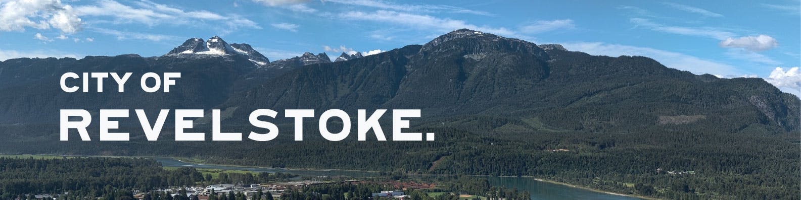
Why “CITY OF REVELSTOKE.” ?
This municipality was incorporated as the “City of Revelstoke” back in 1899. That’s our official name.
Haven’t we seen this already?
Tourism Revelstoke, the City of Revelstoke and the Chamber of Commerce work together to support and improve the community (and have done so for many, many years). It makes sense that we have similar looks. This is a common practice across municipal governments.
Why the full stop?
Love it or hate it, you recognise it. But it’s more than just a punctuation mark. The period has been a part of Revelstoke's identity since its founding. It appeared on the original signage at the Railway Station and on the first City Hall building. It’s quirky, creative, unique, and a conversation starter. And if there’s one thing we know about our community, it’s that we’re all of those things - and we love a good discussion!
How much will this cost me?
There is no tax increase due to this project. Unlike many local governments, we have worked on this project in-house. The additional work, completed by a local graphic designer, was accounted for in the operational budget.
But won't it cost money to replace all the signs?
This project is primarily focused on creating consistency in our administrative communications. Signage follows the Wayfinding Strategy—a grant-funded initiative approved by the provincial government in 2018. Any street signage changes you notice are part of that project.
What will we see during the rollout process then?
- More accessible language. We’re making communications more engaging by using less technical language, shorter sentences, and a community voice.
- More heritage photographs. This brand blends Revelstoke's heritage visually with the future we’re building together.
- More locally designed graphics.
Why did it take this long?!
Although this project was necessary to create consistency across communications, the City has had other priorities. Because it was done in-house, staff had to shift focus when urgent matters arose—such as activating the Emergency Operations Center during the Trout Lake and Shelter Bay wildfires in 2024. A longer timeline allowed us to complete the project with minimal cost.
How did the community participate in this project?
Mayor Gary Sulz unveiled four design concepts at Revelstoke’s Winter Carnival Opening Ceremony in 2024, launching a month-long public vote. The results informed Council’s final decision and the new logo.
Community engagement in March 2024 included:
- 2 social media posts
- 2 City Views newsletter inclusions
- 10 posters displayed around the community
- 1 big reveal event at the Winter Carnival
- 9 in-person pop-up voting stations (over 22 hours of in-person engagement)
- 2 media interviews (Mountaineer and StokeFM)
- 4 media articles (online, print and radio)
- And a full project overview was available on TalkRevelstoke
The results of the engagement were as follows:
- Design One: 227 votes
- Design Two: 126 votes
- Design Three: 147 votes
- Design Four: 54 votes
- Merge Design One and Two: 20 votes
- Modernize the current logo: 10 votes
- Use or update the 1977 logo: 16 votes
- Run an art competition: 17 votes
- Other comments, advice or general feedback: 59 submissions.
Council reviewed the results and feedback, deciding to create a wordmark version of “CITY OF” to match “REVELSTOKE.” and to commission a local designer to create Revelstoke-specific graphic elements, including the Mount Begbie silhouette and bear icons. Staff worked behind-the-scenes to get this completed - the final brand was revealed to the community on Saturday, August 30, during the last REVY.Live music event. A huge thank you to Arts Revelstoke for allowing the City to participate in their event; to local baker, Cassie, for baking 100 cupcakes, and to staff, Council and the community for attending!
Can you explain each of the project's elements?
- The "CITY OF REVELSTOKE." logo.
The logo pays tribute to our history—especially the railway’s role in shaping Revelstoke. The REVELSTOKE typeface is inspired by historic signage from the original train station, grounding our identity in heritage and place. - The colour palette - a mix of historic and natural colours:
> Burgundy and gold reflect the railway and past City branding
> Green, navy, and snow white celebrate our natural surroundings - We chose fonts that reflect Revelstoke’s industry and heritage:
> Trade Gothic Next (bold, strong sans serif)
> Walbaum Text (serif for historical depth)
> Arial (practical and widely usable across departments) - The visual elements - distinctive visuals that reflect Revelstoke’s landscape, spirit, and identity:
> Mount Begbie Silhouette: A grounding presence and iconic landmark, used flexibly across materials.
> Bear Icons: Symbolizing strength, curiosity, and our connection to nature. Custom icons in various styles suit both playful and formal contexts.
> Revelstoke Squares: Custom illustrations of key landmarks (Courthouse, Big Eddy Bridge, bear, and the bandstand, with more to come) in a simple, graphic style for digital and print use. - Research was completed using the Official Community Plan (2022) and the Wayfinding Strategy as key resources. Consultation included: Senior Leadership Team, City staff, Cathy English (Revelstoke Museum & Archives), Tourism Revelstoke, Revelstoke Railway Museum and 600+ of Revelstoke's residents. Their input shaped the project’s direction.
If you have questions about this project, please email communications@revelstoke.ca and we'll get back to you as soon as we can!